Why I like this Mother’s Day email from Apple

I’ve always been a big fan of Apple’s email marketing and a Mother’s Day email I received today is no exception.

Let’s take a look at why it’s so good.

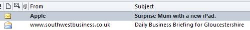
1. Firstly the from name and subject line.

The from name is blissfully clear. Simply “Apple”. Not “Apple Newsletter” or “Apple Europe”.

The subject line is succinct and evocative and uses the word “Mum” rather than the more generic “Mother’s Day”.

Apple subject line

2. Secondly the email itself.

 The images below are an extract from the full email. Not actual size.

Apple Mother's Day email

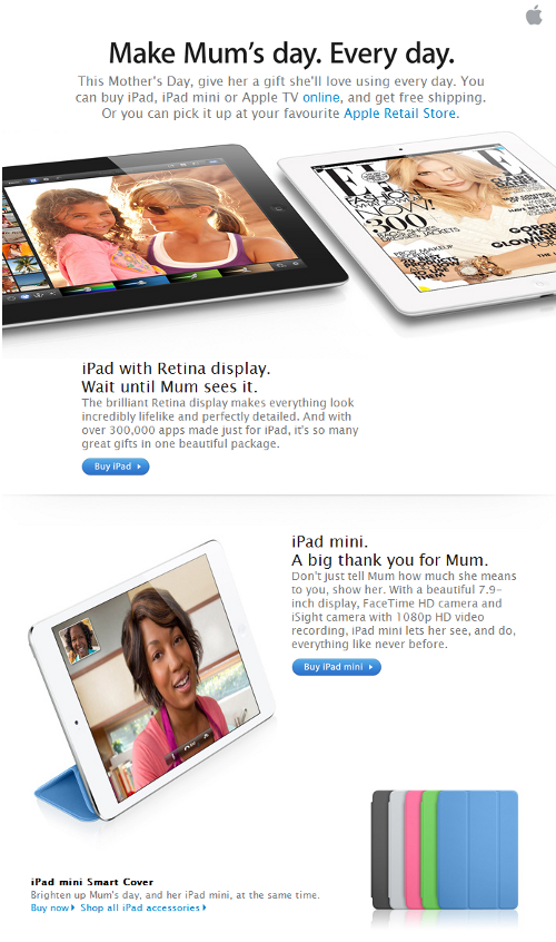
< The branding is subtle. No need for a massive masthead.

< Short and succinct headlline.

< Clear how to buy information.


< The design has plenty of white space making it much easier to read.

< The call to action”Buy iPad” is succinct. Far better than “Click here to visit our online store”.


Email marketing – why you should make it easy to unsubscribe

But why? Surely you want to prevent people from unsubscribing?

No. We say make it easy to unsubscribe. Here’s why.

Making it easy to unsubscribe…

1. Cleans your list ensuring you’re not wasting money emailing people unnecessarily.

2. Ensures you’re only communicating with people who want to hear from you.

3. Means people are less likely to report as spam. Too many spam complaints will affect your sender reputation and you could even end up on a spam blacklist. Google, Hotmail and AOL have a “report spam” button which people will click if they can’t easily find the unsubscribe link.

4. Provides a much better user experience and leads to less frustration. Every subscriber interaction with your business should be as positive as possible.

Our top tips for easy unsubscribe

  1. Include an unsubscribe link in the header of your e-newsletter along with a permission reminder of why they are receiving it.
  2. Include a second unsubscribe link at the end of the e-newsletter. Make it part of the main body of the email, don’t hide it in the small print footer. And do make it legible.

Below are two recent examples of poor unsubscribe positioning.

In both cases the unsubscribe link is buried in the lengthy small print text at the foot of the newsletters and are very difficult to find.

Example 1: 

Unsubscribe example
Example 2

Unsubscribe example

How to generate great content for your email newsletter


I often hear businesses say they want to launch an e-mail newsletter but cannot think of what to put in it.  With a bit of planning all businesses should find they have plenty to say! 

Here are some content ideas 

  1. NewsWrite educational, how-to tips and articles.
  2. Create a series about your product/service.
  3. Highlight products and services which clients may not be aware of.
  4. Include a client case study.
  5. Share company successes and awards.
  6. Interview an employee.
  7. Share some behind-the-scenes information about your company or product.
  8. Comment on industry trends and news. This will improve credibility.
A good idea is to create a content calendar in Excel or Word.  

This means you can map out your content for the coming months as you think of it. The newsletter then becomes less of a chore when the time comes to write your content.

It also enables you to effectively create follow up articles and avoid repeating what’s gone before.

A content calendar is perfect for any business which has an element of seasonality or deadlines. For example accountants and financial advisers or gardening related businesses.

A word of caution.

It’s easy to get immersed in your own world. So if you’re sharing good news about your business, do explain why it’s relevant to your readers. Apply the “so what?” test!

Don’t say: “We’ve just spent £100,000 moving to new offices”. (So what?).

Do say: “We’ve just moved to purpose built offices at XYZ address and taken on ten new staff. This includes a purpose built call centre meaning we can now respond to your service calls much more quickly”.

How to welcome e-newsletter subscribers effectively

The welcome message for new e-newsletter subscribers is something that is often overlooked.

It’s an important step towards creating a one-to-one relationship with new subscribers.

If you use an email service provider (Mailchimp, Constant contact etc) the welcome message can be fully automated. Do contact us for guidance.

WelcomeTips for effective subscriber welcome messages

1. Include your company name or brand in the subject line and in the ‘from’ section.
2. Thank people for signing up.
3. Confirm what they’ve signed up for.
4. Reiterate the benefits of subscribing and what they can expect along with the frequency of emails.
5. Remind them that they can unsubscribe at any time.
6. Reward them with an offer. For example a money off coupon or a free e-book.
7. Include links to key pages on your website and to Facebook and Twitter.
8. Include your contact details and sign off from a real person.

How to improve customer retention with email autoresponders

Auto what?!

Autoresponders go by a few different names like triggered emails and drip campaigns, but essentially they are an automated email, or sequence of emails sent when a subscriber meets a condition you set.

AutoresponderHere are four powerful examples of auto responders:

  1. A user subscribes and receives a series of tips, spread across a number of days or weeks. We recently did one of these for a client called ‘17 Days to Better Grammar‘. (Well worth a read by the way!).
  2. A customer is getting married. They subscribe on your website and enter their wedding date. They receive 10 weekly tips and things to do in the countdown to the big day.
  3. A house owner wants to prepare their house for sale in order to get the best price.. They subscribe on an estate agent’s website and receive weekly tips on what changes they should make.
  4. A business wants to add a personal touch by sending an email birthday card to clients along with a special offer.

OK, but why set up auto responders?

The key benefits of auto responders are customer acquisition and retention. And once set up they work automatically. Like a silent salesman!

By providing tips and advice like the examples above you are adding value for clients and at the same time building trust and credibility by sharing knowledge and expertise.

We’ll make it really easy to get your auto responder up and running.
Get in touch to find out more.

Here are some more examples which we’ve recently set up for clients.

1. Monty’s Bar & Brasserie

When you subscribe to the Monty’s newsletter you can optionally enter your birthday and anniversary dates. Monty’s also collect this data from customers who visit the restaurant. Customers then receive a birthday email and/or an anniversary email every year with a special offer. Because Monty’s is a bar and brasserie we send the emails ahead of the date in question to give people enough time to book.

Auto responder

2. East Glos Club, Tennis and Squash, Cheltenham

East Glos is a very large club with over 1,000 members and it can sometimes take members a little while to settle in after joining. We send this very simple email to new members six weeks after joining to ask how they’re getting on and to re-assure them that help is available if needed.

Autoresponder


E-newsletter list quality – what it is and why it matters

List quality

So, you’ve decided to do some email marketing.  You’ve got 5,000 opt in email addresses built up over 10 years. You’re ready to send out your first issue.

Oh no you’re not!

Unless you check and clean your contacts frequently it’s likely the quality of your list will be very poor. The results from your email marketing are very likely to be disappointing. With poor list quality you will waste money by sending it to people who have no interest in reading it or because their email address no longer exists.

It’s far better to have a high quality, smaller list of 1,000 emails than a low quality list of 5,000. A high quality list means your subscribers are more likely to be engaged by your content and do business with you at some stage.

Here are some simple steps to clean your list:

1. What is the age of each contact record? Ie. When was the record created?
A good rule of thumb is not to send to contacts which are more than two years old unless you can definitely say they are still active contacts. Most decent contact management / CRM packages automatically log a record creation date which will help with this task.

2. What is the relevancy of that contact?
Some small and medium-sized businesses I talk to don’t have an effective contact management / CRM system in place. For example they just pile all the contacts together into Outlook – business contacts, former work colleagues, relatives and friends.  If this is you, check if that contact is relevant for your e-newsletter before using it.

3. Personal knowledge.
Having actioned (1) and (2) above, scan the list and use your personal knowledge to decide if the contact stays or goes. Do they still work for that company? Are they still trading? Have they retired?

4. The final stage – having cleaned the list and before you send your e-newsletter.
When you first send the e-newsletter to your newly cleaned list, explain to people in the header why they’re receiving it and include at least two unsubscribe links. One in the header and one just below your sign off.
If they unsubscribe from your first newsletter that’s OK. It makes your list even cleaner and ensures you’re only sending to interested recipients.

Ps. As well as the explanation of why they’re receiving the newsletter in the header, another useful technique for your first edition is to include an engaging opening greeting.  Here’s an example from a recent client’s first newsletter.

We’re sending you this newsletter because we’ve met at some point in the past. Perhaps you’re an existing professional contact or we’ve met you at one of the many business networking events we attend.  Whatever the reason we’ll never knowingly send spam and hope you benefit from receiving this newsletter. Please unsubscribe here if you no longer wish to receive it.

How to avoid losing subscribers due to illegible content

If your e-newsletter or e-shot are difficult to read, subscribers are more likely to delete it without reading.

Illegible content

An obvious statement perhaps but I am frequently amazed by the number of e-newsletters I receive which have illegible content.

Subscribers make their “open and read” decisions very quickly, particularly if reading on a smartphone. If subscribers have to strain their eyes or move closer to the screen to read your content many won’t bother. They will delete without reading.

My advice is simple. Make sure all elements of your e-newsletters are legible including areas such as terms and conditions and unsubscribe links.

This means making sure your font sizes are not too small. If in doubt make them a point or two larger. It also means ensuring your font colour is legible against your chosen background colour.

Here are some recent examples of newsletters I’ve received. Brand names have been obscured to spare blushes!

Example 1

Here various links such as unsubscribe and forward to a friend are illegible due to the grey text on a bright green background. The font is also very small which isn’t helping.

Illegible

Example 2

In this example the text is far too small to be read easily. This text was in the main body of the newsletter. My eyesight is pretty good and I had to move closer to the screen to try and read it. Even then it was difficult.

Illegible

Example 3 – major national retailer

The call to action here is aimed at people who have received a forwarded copy. The text is inviting them to subscribe. As you can see it’s almost impossible to read and this important message is buried in the small print at the end of the newsletter. This call to action, which is aimed at boosting subscribers, should be at the top and in legible font.

Illegible

The other faux pas being committed is the “please do not reply to this email” message. I don’t agree with “do not reply” email addresses as I think you should make it easy for subscribers to get in touch.

In this example they’re asked to go to a Contact Us web page. The only problem is most people won’t see this message because it’s so small.