5 easy ways to instantly improve your email marketing

Here are five really simple tips which you can use immediately to improve your email marketing.

With opens on mobile devices now exceeding 50%, it’s vital to design with mobile in mind, while not forgetting desktop users.

Recent research shows that if an email doesn’t look good on mobile, many users will delete, or at worst unsubscribe.

All these tips will make your emails more mobile-friendly and help you produce succinct, compelling copy.

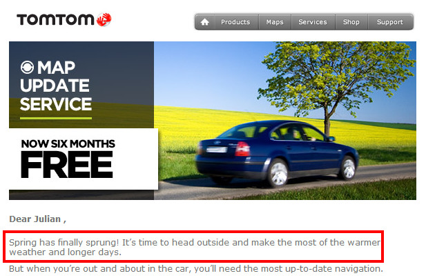
1. Use buttons for your calls to action

Buttons will always generate more clicks than text links, especially for mobile users.

Consider which of these is more likely to get clicked.

The 10th annual Comic Arts Festivals is taking place in Brighton next month, and you can register here to get your tickets online.

Or

The 10th annual Comic Arts Festivals is taking place in Brighton next month.

If you’re using a platform such as MailChimp, buttons are straightforward to add.

2. Keep your calls to action short and avoid friction words

This first example is far too long, and everyone will know it’s a link, so you don’t have to instruct them to click.

The second example is much shorter and reiterates the benefit.

Friction words are those that imply your reader has to do something they don’t necessarily want to do.

Common friction words include:

  • Download
  • Buy
  • Order
  • Submit

This example is for a free copywriting guide.

The second example reiterates the benefit. It doesn’t even need to state the need to download it – readers will know this.

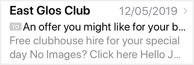
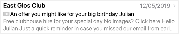
3. Always include a pre-header

A pre-header is the summary text that follows the subject line when viewing an email from the inbox.

Many mobile, desktop and web email clients display email pre-headers to provide a preview of what the message contains before you open it.

Pre-headers deliver a seven per cent higher open rate, on average.

Pre-headers also come in handy if the subject line has been truncated as in the first example below.

In this example, which is landscape view on an iPhone, both the subject line and pre-header are visible, thus complementing each other perfectly.

In the examples above, without a pre-header, subscribers would only see “No images? Click here”.

4. Keep it succinct. Use short sentences and paragraphs

Subscribers are more likely to read and act on short and punchy emails.

After you’ve written your copy, re-read it, and remove any superfluous words.

We’d like to take this opportunity to thank all our customers for their business over the past year.

becomes

Thank you for your business in 2019; we appreciate it.

5. It’s not about you. It’s about them

I regularly receive emails from businesses headed “Here’s what we’ve been up to”.

Yawn.

Often, these include articles such as “Here are some websites we’ve built recently” or “We’d like to welcome John Smith to our accounts team. His hobbies are rambling and trainspotting”.

So what? How does this “news” benefit the reader?

Taking the second example, by all means, announce John, but explain the benefits for the customer. So it could become:

New appointment brings faster turn-round for your PAYE enquiries

We’re delighted to welcome John Smith to our accounts team. John has ten years’ payroll experience, and he will be your dedicated point of contact for PAYE enquiries. As a result our turn-round time for queries will reduce from 48 to 24 hours.

• About the author

Julian Wellings has 12 years’ email marketing experience and works with clients across the UK.


Why the plain text version of your e-newsletter is important

When you create your e-newsletter or e-shot, if you’re using an email service provider such as Mailchimp or Campaign Monitor, a plain text version is automatically created for you.

It’s vital to include a plain text version otherwise ISPs will assume your email is from an untrustworthy source and could block it as spam. Another reason is some recipients prefer to read in plain text rather than HTML.  In fact, some corporate email systems still use plain text as their default.

It’s also important that you then edit your plain text version, not just to aid readability but also to increase the chances of conversion.

Campaign Monitor have produced some excellent tips on plain text emails.

Read “How to turn your plain-text emails into conversion machines” >

How to avoid your email marketing looking like spam

Have you noticed how spammers and scammers use personal names rather than brand names in the “from” section of their emails? Usually they’re female names.

Here’s a recent example.

Spam example

The reason why they do this is hopefully obvious. It’s so that the email looks like it’s from a real person.

My tip to avoid looking like a spammer.

Use your business name as the “from” name. 
If you use your own name, and not everyone on your list knows who you are, this may affect your open rate.  I receive a lot of email marketing emails done like this. Another option is to use your business name followed by your own name.  Eg.  From: [Expertise on Tap – Julian Wellings]

Email marketing – how NOT to manage your unsubscribe process

I’ve blogged before about why your unsubscribe process should be as simple as possible – ideally a one click process.

The screen shot below from Avid is a good example of how not to do it. Instead of a one click unsubscribe, where you click a link in the newsletter and it’s sorted, with Avid you’re taken to a web page with a myriad of choices. In fact it’s not an unsubscribe page at all – it’s a subscribe page.

Only on looking closely do you find a tiny unsubscribe link at the foot of the page. When you click this, it won’t process until you enter your email address. Again, with a one click process you should not have to enter your email address.

To summarise:

  1. Keep your unsubscribe process simple.
  2. If you want subscribers to be able to manage their preferences or interests, if you use an email service provider such as Mailchimp or Campaign Monitor it’s possible to add a link to enable this. Make sure the preferences are kept to a minimum.
Avid unsubscribe process

Example of Avid unsubscribe process.

How BBC Radio 2 recognised the power of email to engage with listeners

BBC Radio 2 has recently launched Radio 2 Mail, a weekly e-newsletter with the strapline “Sharing what we love about Radio 2”

Radio 2 MailThese days the BBC has many ways of engaging with it’s audience ranging from phone ins, texts into programmes, and of course Twitter and Facebook. So, I found it refreshing that Radio 2 has recognised the power of email newsletters as an additional way of engaging with listeners.

And they’ve executed it really well.

The copy on their Radio 2 Mail web page is full of benefit statements and emotive keywords. For example:

Handpicked by our very own presenters.
Each week, a different presenter will round up their favourite moments on Radio 2.
They might even let you in on a few behind-the-scenes secrets!

The welcome email you receive after subscribing is warm and inviting, with a link to a video featuring four of the presenters. See below…

How could you use an email newsletter in your business to engage with your prospective clients and build brand awareness? I can help. Ask me how.

Example of Radio 2 Mail welcome email

Radio 2 Mail welcome email


Why this e-shot from Apple is perfect. In every way.

Apple have just sent me the email below promoting the new iPhones.  Apple’s email marketing always stands out from the crowd, but this one is special.

Here’s why.

The opening paragraph is brief yet sells lots of benefits. Apple is all about making it easy for the consumer, and that’s what they’re doing here. “We’ll ship it for free”.  “We’ll set it up just how you want it”.

The two product sections have lots of white space and are uncluttered. The product shots don’t even have a front view. My assumption is iPhone brand awareness is so high that they don’t need to even show the front. The side shot perfectly encapsulates the range of colours available.

The “Buy Now” buttons are small and understated.  It’s just not Apple’s style to use massive BUY NOW!!! calls to action.

Apple e-shot


Email marketing – how a minor change to content can have a big impact

The position of links in your email newsletter or e-shot can have a big impact on your click through rates.

Here’s a brief case study from our client British Bespoke Auctions.

Their monthly newsletter is a preview of the following week’s auction, and includes links to the various auction categories as well as photos and links for selected items.

We usually achieve a 40% click through rate which is pretty good. However we assumed that all subscribers simply wanted to be able to home in on categories and items of interest.

For last month’s newsletter we said,”what if someone just wants to go straight to the catalogue and have a good old browse?”

So we added a prominent View Catalogue link at the top of the newsletter. you can see the result below – see the red ring.

A massive 38% of clicks came from that single link thus proving our theory that all some people wanted to do was view the catalogue! We also increased the overall click rate from 40% to 51%.

Conclusions

Try new approaches and put yourself in the shoes of the recipient. Then test to see if that approach has been successful, by monitoring trends for opens, clicks and unsubscribes.

Tip

The screen shot below from Campaign Monitor uses a clicks map, which is a very powerful way of working out which links and which link positions worked well. You could use this to repeat the same links in different positions in a campaign, and then analyse which was the more popular. Mailchimp also has this functionality.

Link Activity for British Bespoke Auctions next Thursday s Sale Catalogue Expertise on Tap Email Marketing Reports System


How to massively increase clicks for videos in your email marketing

Here’s a really quick and simple tip.

If you’re including video in your email newsletters and e-shots, you’ll know that at the moment, most email clients don’t support embedded videos.

So you might be thinking your only option is some hyperlinked text saying “Watch the video…”.

Wrong!

The best way to massively increase clicks for your video is to embed it as a screen grab and overlay a play button onto it, so it looks like an embedded video.

Yes, you need to have a text link as well, for people whose email clients are blocking images, but the screen grab will get many more clicks.

Below are two examples from a client e-newsletter I produce, which prove this.  The percentage of clicks the image got is shown at the  bottom, and clicks for the the text link are at the top.  As you’ll see there’s a big difference.

How to take a screen grab of a video

In Windows you could use the built in snipping tool, or if you’ve edited the video yourself most editing programs will allow you to take a screen grab of a video frame.

To overlay the play button you can do this in most image editing software. You can find a good selection of play button images on iconfinder.com.

Do contact me if you get stuck!

How to massively increase clicks for video in email marketing

How to massively increase clicks for video in email marketing

Why you should include a subscribe link in your email newsletter

SubscribersAdding a prominent subscribe link to your email newsletter is a great way of growing your list.

This is where you might well say “Why do I need one? They’re already subscribed aren’t they?”

Not necessarily.

If someone has received a forwarded copy or read the newsletter on social media, by including a prominent subscribe link will enable them to do just that. Most people won’t go hunting for a sign up form on your website so this is all about making it easy for them.


Be careful when pre-scheduling your email marketing

Using an email service provider such as Mailchimp or Campaign Monitor is the only way to do your email marketing properly. A useful feature is the ability to prepare your e-shots in advance and schedule them to send on a particular day.

This can be useful if you’re going to be out of the office on the day of send, or if you want to optimise your workflow by preparing content in advance.

However, there is one potential downside to pre-scheduling. By the time your content is sent, it could have become be embarrassing, or at worst insensitive.

Here’s an example from TomTom which proclaims:

Spring has finally sprung! It’s time to head outside and make the most of the warmer weather.
It’s complemented by a nice picture of a car driving past a spring meadow!

The only problem is it was sent on Friday 22nd March 2013, a weekend which saw snow and freezing temperatures across the UK. My guess is it was prepared some time in advance and pre-scheduled.

TomTom email example

The red highlighting is mine, for emphasis.


Now, I’m a fan of TomTom’s email marketing, and I’m sure this weather faux pas won’t have done their reputation too much harm!

However, I recommend:

If you are going to pre-schedule your e-shots, check whether there is any content which could potentially cause a problem for you. If so, then it’s worth making a diary note to double check the day before the scheduled send.
Here are some examples:
  1. Weather related content, like the TomTom example above.
  2. Topical content. For example, something relating to the economy where the situation might have changed by the time the email goes out.
  3. Natural disasters or political unrest. For example, a travel company promoting a destination where an earthquake or an uprising has just taken place.