Why this e-shot from Apple is perfect. In every way.

Apple have just sent me the email below promoting the new iPhones.  Apple’s email marketing always stands out from the crowd, but this one is special.

Here’s why.

The opening paragraph is brief yet sells lots of benefits. Apple is all about making it easy for the consumer, and that’s what they’re doing here. “We’ll ship it for free”.  “We’ll set it up just how you want it”.

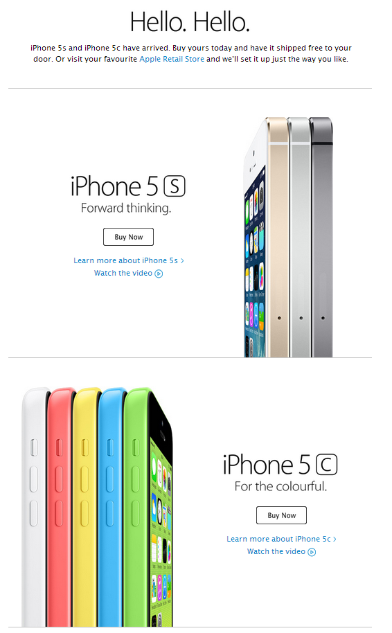
The two product sections have lots of white space and are uncluttered. The product shots don’t even have a front view. My assumption is iPhone brand awareness is so high that they don’t need to even show the front. The side shot perfectly encapsulates the range of colours available.

The “Buy Now” buttons are small and understated.  It’s just not Apple’s style to use massive BUY NOW!!! calls to action.

Apple e-shot


Email marketing – why you should make it easy to unsubscribe

But why? Surely you want to prevent people from unsubscribing?

No. We say make it easy to unsubscribe. Here’s why.

Making it easy to unsubscribe…

1. Cleans your list ensuring you’re not wasting money emailing people unnecessarily.

2. Ensures you’re only communicating with people who want to hear from you.

3. Means people are less likely to report as spam. Too many spam complaints will affect your sender reputation and you could even end up on a spam blacklist. Google, Hotmail and AOL have a “report spam” button which people will click if they can’t easily find the unsubscribe link.

4. Provides a much better user experience and leads to less frustration. Every subscriber interaction with your business should be as positive as possible.

Our top tips for easy unsubscribe

  1. Include an unsubscribe link in the header of your e-newsletter along with a permission reminder of why they are receiving it.
  2. Include a second unsubscribe link at the end of the e-newsletter. Make it part of the main body of the email, don’t hide it in the small print footer. And do make it legible.

Below are two recent examples of poor unsubscribe positioning.

In both cases the unsubscribe link is buried in the lengthy small print text at the foot of the newsletters and are very difficult to find.

Example 1: 

Unsubscribe example
Example 2

Unsubscribe example

How to generate great content for your email newsletter


I often hear businesses say they want to launch an e-mail newsletter but cannot think of what to put in it.  With a bit of planning all businesses should find they have plenty to say! 

Here are some content ideas 

  1. NewsWrite educational, how-to tips and articles.
  2. Create a series about your product/service.
  3. Highlight products and services which clients may not be aware of.
  4. Include a client case study.
  5. Share company successes and awards.
  6. Interview an employee.
  7. Share some behind-the-scenes information about your company or product.
  8. Comment on industry trends and news. This will improve credibility.
A good idea is to create a content calendar in Excel or Word.  

This means you can map out your content for the coming months as you think of it. The newsletter then becomes less of a chore when the time comes to write your content.

It also enables you to effectively create follow up articles and avoid repeating what’s gone before.

A content calendar is perfect for any business which has an element of seasonality or deadlines. For example accountants and financial advisers or gardening related businesses.

A word of caution.

It’s easy to get immersed in your own world. So if you’re sharing good news about your business, do explain why it’s relevant to your readers. Apply the “so what?” test!

Don’t say: “We’ve just spent £100,000 moving to new offices”. (So what?).

Do say: “We’ve just moved to purpose built offices at XYZ address and taken on ten new staff. This includes a purpose built call centre meaning we can now respond to your service calls much more quickly”.

How to avoid losing subscribers due to illegible content

If your e-newsletter or e-shot are difficult to read, subscribers are more likely to delete it without reading.

Illegible content

An obvious statement perhaps but I am frequently amazed by the number of e-newsletters I receive which have illegible content.

Subscribers make their “open and read” decisions very quickly, particularly if reading on a smartphone. If subscribers have to strain their eyes or move closer to the screen to read your content many won’t bother. They will delete without reading.

My advice is simple. Make sure all elements of your e-newsletters are legible including areas such as terms and conditions and unsubscribe links.

This means making sure your font sizes are not too small. If in doubt make them a point or two larger. It also means ensuring your font colour is legible against your chosen background colour.

Here are some recent examples of newsletters I’ve received. Brand names have been obscured to spare blushes!

Example 1

Here various links such as unsubscribe and forward to a friend are illegible due to the grey text on a bright green background. The font is also very small which isn’t helping.

Illegible

Example 2

In this example the text is far too small to be read easily. This text was in the main body of the newsletter. My eyesight is pretty good and I had to move closer to the screen to try and read it. Even then it was difficult.

Illegible

Example 3 – major national retailer

The call to action here is aimed at people who have received a forwarded copy. The text is inviting them to subscribe. As you can see it’s almost impossible to read and this important message is buried in the small print at the end of the newsletter. This call to action, which is aimed at boosting subscribers, should be at the top and in legible font.

Illegible

The other faux pas being committed is the “please do not reply to this email” message. I don’t agree with “do not reply” email addresses as I think you should make it easy for subscribers to get in touch.

In this example they’re asked to go to a Contact Us web page. The only problem is most people won’t see this message because it’s so small.