The position of links in your email newsletter or e-shot can have a big impact on your click through rates.
Here’s a brief case study from our client British Bespoke Auctions.
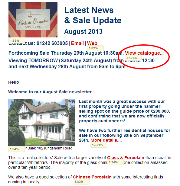
Their monthly newsletter is a preview of the following week’s auction, and includes links to the various auction categories as well as photos and links for selected items.
We usually achieve a 40% click through rate which is pretty good. However we assumed that all subscribers simply wanted to be able to home in on categories and items of interest.
For last month’s newsletter we said,”what if someone just wants to go straight to the catalogue and have a good old browse?”
So we added a prominent View Catalogue link at the top of the newsletter. you can see the result below – see the red ring.
A massive 38% of clicks came from that single link thus proving our theory that all some people wanted to do was view the catalogue! We also increased the overall click rate from 40% to 51%.
Conclusions
Try new approaches and put yourself in the shoes of the recipient. Then test to see if that approach has been successful, by monitoring trends for opens, clicks and unsubscribes.
Tip
The screen shot below from Campaign Monitor uses a clicks map, which is a very powerful way of working out which links and which link positions worked well. You could use this to repeat the same links in different positions in a campaign, and then analyse which was the more popular. Mailchimp also has this functionality.