Email marketing – how NOT to manage your unsubscribe process

I’ve blogged before about why your unsubscribe process should be as simple as possible – ideally a one click process.

The screen shot below from Avid is a good example of how not to do it. Instead of a one click unsubscribe, where you click a link in the newsletter and it’s sorted, with Avid you’re taken to a web page with a myriad of choices. In fact it’s not an unsubscribe page at all – it’s a subscribe page.

Only on looking closely do you find a tiny unsubscribe link at the foot of the page. When you click this, it won’t process until you enter your email address. Again, with a one click process you should not have to enter your email address.

To summarise:

  1. Keep your unsubscribe process simple.
  2. If you want subscribers to be able to manage their preferences or interests, if you use an email service provider such as Mailchimp or Campaign Monitor it’s possible to add a link to enable this. Make sure the preferences are kept to a minimum.
Avid unsubscribe process

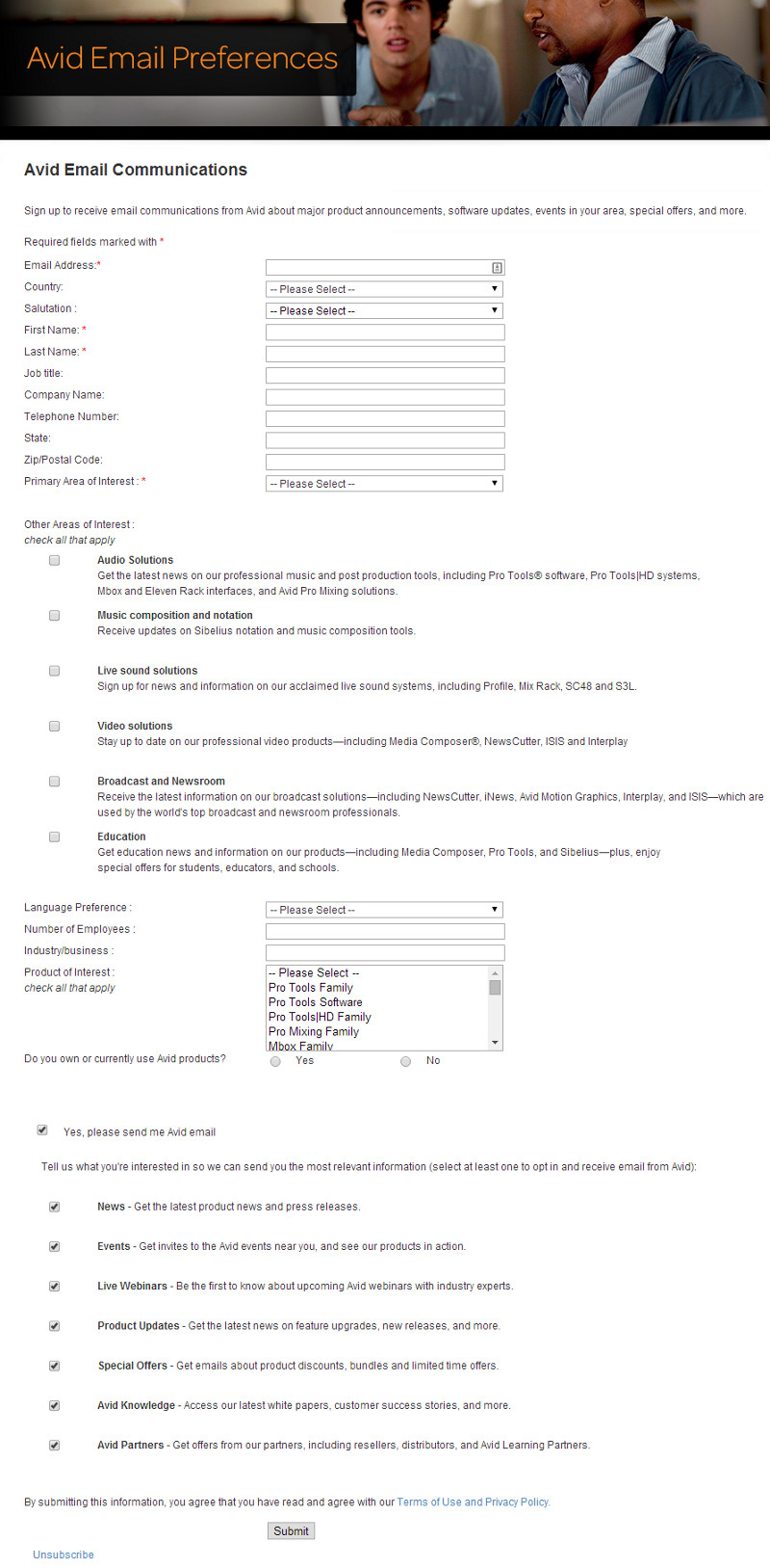
Example of Avid unsubscribe process.

Email marketing – how a minor change to content can have a big impact

The position of links in your email newsletter or e-shot can have a big impact on your click through rates.

Here’s a brief case study from our client British Bespoke Auctions.

Their monthly newsletter is a preview of the following week’s auction, and includes links to the various auction categories as well as photos and links for selected items.

We usually achieve a 40% click through rate which is pretty good. However we assumed that all subscribers simply wanted to be able to home in on categories and items of interest.

For last month’s newsletter we said,”what if someone just wants to go straight to the catalogue and have a good old browse?”

So we added a prominent View Catalogue link at the top of the newsletter. you can see the result below – see the red ring.

A massive 38% of clicks came from that single link thus proving our theory that all some people wanted to do was view the catalogue! We also increased the overall click rate from 40% to 51%.

Conclusions

Try new approaches and put yourself in the shoes of the recipient. Then test to see if that approach has been successful, by monitoring trends for opens, clicks and unsubscribes.

Tip

The screen shot below from Campaign Monitor uses a clicks map, which is a very powerful way of working out which links and which link positions worked well. You could use this to repeat the same links in different positions in a campaign, and then analyse which was the more popular. Mailchimp also has this functionality.

Link Activity for British Bespoke Auctions next Thursday s Sale Catalogue Expertise on Tap Email Marketing Reports System


Be careful when pre-scheduling your email marketing

Using an email service provider such as Mailchimp or Campaign Monitor is the only way to do your email marketing properly. A useful feature is the ability to prepare your e-shots in advance and schedule them to send on a particular day.

This can be useful if you’re going to be out of the office on the day of send, or if you want to optimise your workflow by preparing content in advance.

However, there is one potential downside to pre-scheduling. By the time your content is sent, it could have become be embarrassing, or at worst insensitive.

Here’s an example from TomTom which proclaims:

Spring has finally sprung! It’s time to head outside and make the most of the warmer weather.
It’s complemented by a nice picture of a car driving past a spring meadow!

The only problem is it was sent on Friday 22nd March 2013, a weekend which saw snow and freezing temperatures across the UK. My guess is it was prepared some time in advance and pre-scheduled.

TomTom email example

The red highlighting is mine, for emphasis.


Now, I’m a fan of TomTom’s email marketing, and I’m sure this weather faux pas won’t have done their reputation too much harm!

However, I recommend:

If you are going to pre-schedule your e-shots, check whether there is any content which could potentially cause a problem for you. If so, then it’s worth making a diary note to double check the day before the scheduled send.
Here are some examples:
  1. Weather related content, like the TomTom example above.
  2. Topical content. For example, something relating to the economy where the situation might have changed by the time the email goes out.
  3. Natural disasters or political unrest. For example, a travel company promoting a destination where an earthquake or an uprising has just taken place.


How to generate great content for your email newsletter


I often hear businesses say they want to launch an e-mail newsletter but cannot think of what to put in it.  With a bit of planning all businesses should find they have plenty to say! 

Here are some content ideas 

  1. NewsWrite educational, how-to tips and articles.
  2. Create a series about your product/service.
  3. Highlight products and services which clients may not be aware of.
  4. Include a client case study.
  5. Share company successes and awards.
  6. Interview an employee.
  7. Share some behind-the-scenes information about your company or product.
  8. Comment on industry trends and news. This will improve credibility.
A good idea is to create a content calendar in Excel or Word.  

This means you can map out your content for the coming months as you think of it. The newsletter then becomes less of a chore when the time comes to write your content.

It also enables you to effectively create follow up articles and avoid repeating what’s gone before.

A content calendar is perfect for any business which has an element of seasonality or deadlines. For example accountants and financial advisers or gardening related businesses.

A word of caution.

It’s easy to get immersed in your own world. So if you’re sharing good news about your business, do explain why it’s relevant to your readers. Apply the “so what?” test!

Don’t say: “We’ve just spent £100,000 moving to new offices”. (So what?).

Do say: “We’ve just moved to purpose built offices at XYZ address and taken on ten new staff. This includes a purpose built call centre meaning we can now respond to your service calls much more quickly”.

How to avoid losing subscribers due to illegible content

If your e-newsletter or e-shot are difficult to read, subscribers are more likely to delete it without reading.

Illegible content

An obvious statement perhaps but I am frequently amazed by the number of e-newsletters I receive which have illegible content.

Subscribers make their “open and read” decisions very quickly, particularly if reading on a smartphone. If subscribers have to strain their eyes or move closer to the screen to read your content many won’t bother. They will delete without reading.

My advice is simple. Make sure all elements of your e-newsletters are legible including areas such as terms and conditions and unsubscribe links.

This means making sure your font sizes are not too small. If in doubt make them a point or two larger. It also means ensuring your font colour is legible against your chosen background colour.

Here are some recent examples of newsletters I’ve received. Brand names have been obscured to spare blushes!

Example 1

Here various links such as unsubscribe and forward to a friend are illegible due to the grey text on a bright green background. The font is also very small which isn’t helping.

Illegible

Example 2

In this example the text is far too small to be read easily. This text was in the main body of the newsletter. My eyesight is pretty good and I had to move closer to the screen to try and read it. Even then it was difficult.

Illegible

Example 3 – major national retailer

The call to action here is aimed at people who have received a forwarded copy. The text is inviting them to subscribe. As you can see it’s almost impossible to read and this important message is buried in the small print at the end of the newsletter. This call to action, which is aimed at boosting subscribers, should be at the top and in legible font.

Illegible

The other faux pas being committed is the “please do not reply to this email” message. I don’t agree with “do not reply” email addresses as I think you should make it easy for subscribers to get in touch.

In this example they’re asked to go to a Contact Us web page. The only problem is most people won’t see this message because it’s so small.